This post may contain affiliate links. We may earn money or products from the highlighted keywords or companies or banners mentioned in this post.
If the passport is a symbol of national identity, then the new design for Norway’s travel documents has undoubtedly cemented the country’s reputation as a land of sleek, minimalist beauty.
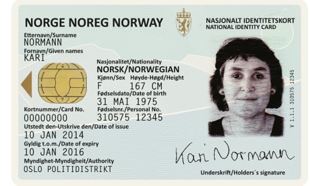
This week, Norway’s National Police Directorate announced the winners of a competition launched in February to find a new design concept for the nation’s passports and ID card.
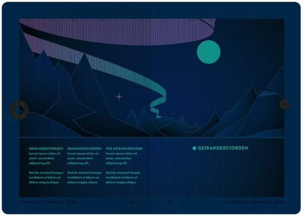
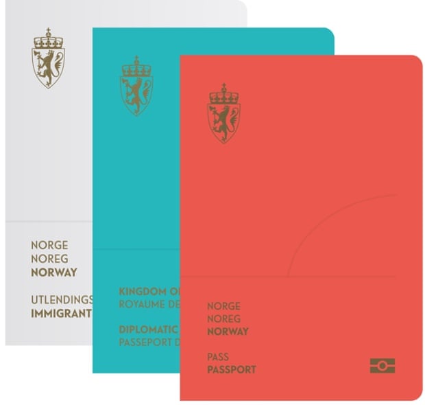
The winning entry, by Oslo design studio Neue, features beautifully simplified depictions of Norway’s natural landscapes drawn with fine lines in pastel shades. The cover features a modernised version of the national crest, stamped in gold on unusually bold colours: either white, turquoise or red for immigrant, diplomat and standard passports respectively.

Photograph: Neue
When shone under UV light, the landscapes within the pages transform to show the northern lights in the night sky, a magical touch that adds a deeper sense of intrigue to the already striking document.
“All Norwegians are so connected to nature, it’s a very strong part of our history and defines us as a country,” says Gørill Kvamme of Neue, who explains that the minimal concept came from seeking to find the “essence of something”.
“It represents the vast variety of nature and landscapes you find in Norway … which makes it relevant to all of us whether you have always lived there or just received your citizenship.”

Photograph: Neue
Praising the design, the jury applauded its wide appeal. “It both illustrates the Norwegian identity and makes sure the passport will be viewed as document of high value,” they said. “The design is attractive and stylish, the colours are subtle and the abstraction of the landscapes are exciting. Aesthetically, the landscape motifs have been given a distinctive look. The jury appreciates the simplicity of the solution.”
Now Neue will work closely with the National Police Directorate to find a way to balance the design with the complicated security expectations of a passport – something they are not currently able to discuss in detail. No date for the passport’s release has been set but it is expected to be within the next two years.

Photograph: Neue
Passports aren’t the only national symbol the state has opened up to the country’s design teams. Last month – as a result of a similar competition – Norges Bank picked proposals from design studios Snøhetta and The Metric System for their new kroner notes. Pixelated and also featuring bold colours, the new notes are due to be released in 2017.
Along with the country’s new passports, they show how progressive design is tied in with the Norwegian way of life. As Kvamme says: “Design has a natural role in helping express what country or culture you are a part of.”
Powered by WPeMatico


