6 days ago
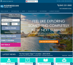
Norwegian Cruise Line has revamped its European websites, improving the customer experience and aiding customers’ booking journey, with a new user-friendly responsive design.
Staying close to the previous scheme with a fresh modern look, the new responsive design will provide better visibility for those using mobile devices and tablets.
And, in sync with this modernisation, the website has also benefited from technology advances to quicken loading times regardless of the device used.
Christian Boell, managing director EMEA, Norwegian Cruise Line, said: “We know that more and more people are using mobile devices to research and book their holidays than ever before and that this is only set to rise.
“It is therefore important for us to make sure that the experience of visiting our website on all devices is always the same high quality, so that our customers can access the information that they want when they want.
“The responsiveness of our improved website directly addresses this and will mean that anyone anywhere can research, book or prepare for their cruise holiday with Norwegian.
“We have also looked at the way that our website flows and the changes we have made regarding the booking journey mean that anyone visiting our website can now transition from page to page seamlessly.”
In line with this update, Norwegian has also refreshed its European e-newsletters.
The new responsive design will ensure that no matter where or how they are being viewed, customers and agents alike can enjoy Norwegian’s news and offers.


